
Appearance
Groups
Interfaces are how users interact with fields on the Item Detail page. These are the standard Groups interfaces.
Accordion
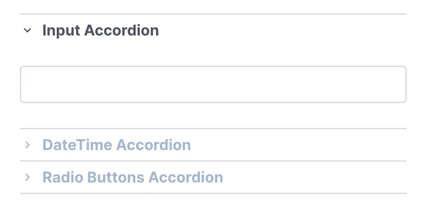
Group interface that allows user to show and hide certain fields within the group by clicking on each field.
- Accordion Mode:
Max 1 Section Open- this will close all other sections when you open a section. - Start:
All Closed,First Opened
Detail Group

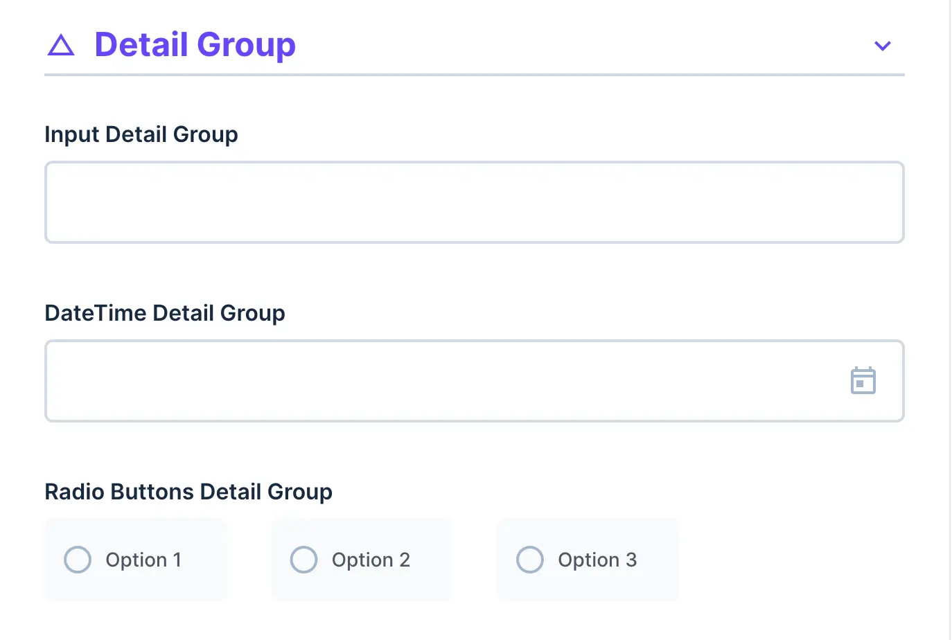
Group interface that allows user to show or hide all fields within the group by clicking on the header toggle.
- Start:
Start Open,Start Closed - Header Icon: Icon to use beside the group label.
- Header Color: Color of the detail group header.
Raw Group
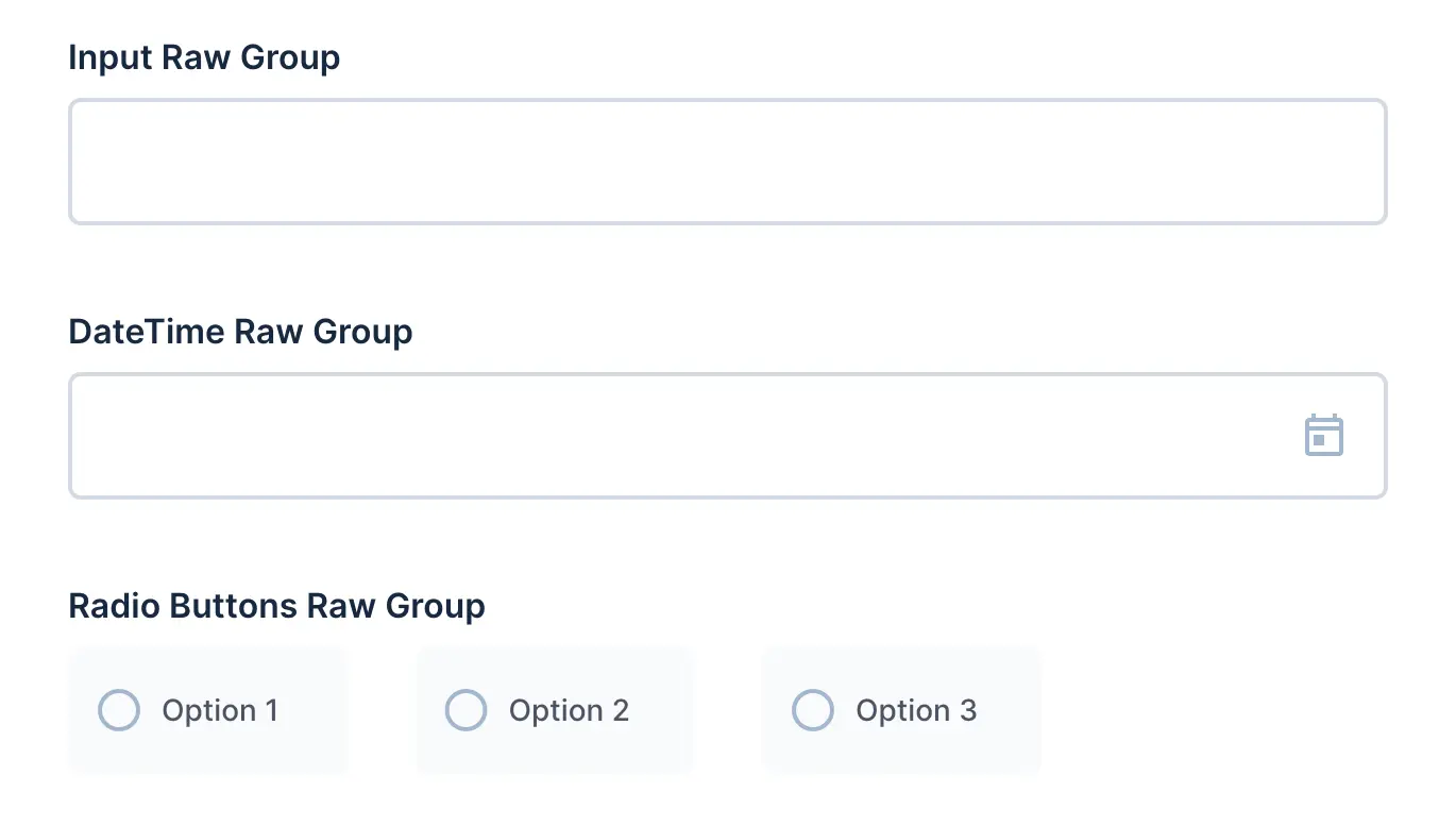
Interface that groups multiple fields together, but always displays them.
- No options available
Other Helpful Info
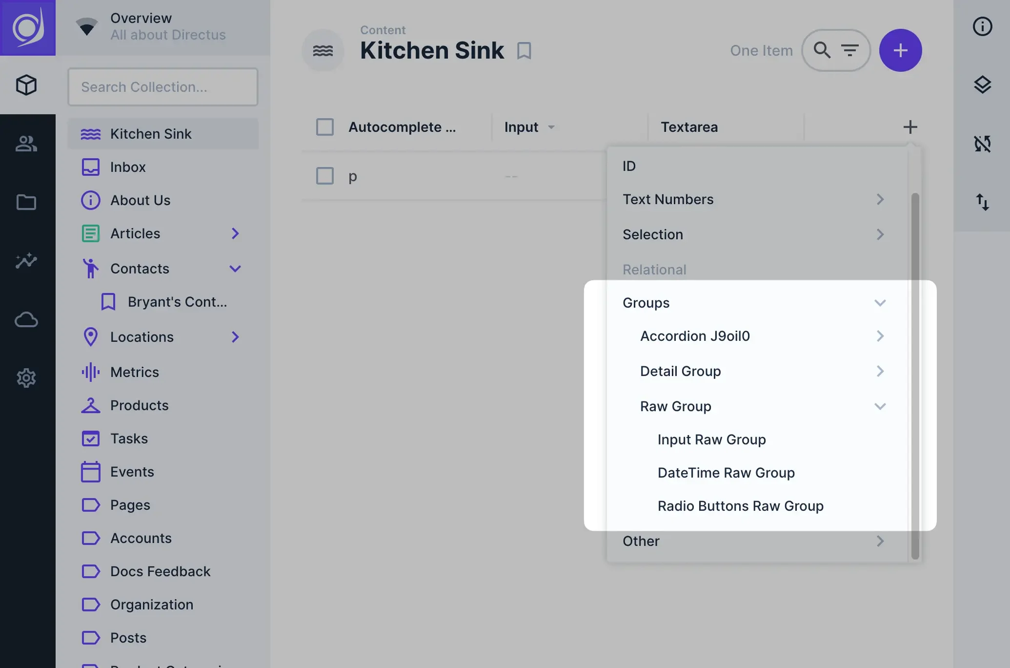
Any fields that you add within a Group will also maintain that grouping throughout the App Studio in filters, dropdowns, and more.